Palantir Basic Tutorial
Table of contents
Introduction
Loading data
Data Processing
Running Palantir
Visualizing Palantir results
Gene expression trends
Clustering of gene expression trends
Introduction
Palantir is an algorithm to align cells along differentiation trajectories. Palantir models differentiation as a stochastic process where stem cells differentiate to terminally differentiated cells by a series of steps through a low dimensional phenotypic manifold. Palantir effectively captures the continuity in cell states and the stochasticity in cell fate determination.
See our manuscript for more details.
Imports
[1]:
import palantir
import scanpy as sc
import pandas as pd
import os

# Plotting
import matplotlib
import matplotlib.pyplot as plt

# warnings
import warnings
from numba.core.errors import NumbaDeprecationWarning

warnings.filterwarnings(action="ignore", category=NumbaDeprecationWarning)
warnings.filterwarnings(
    action="ignore", module="scanpy", message="No data for colormapping"
)

# Inline plotting
%matplotlib inline
Loading data
We recommend the use of scanpy Anndata objects as the preferred mode of loading and filtering data.
A sample RNA-seq csv data is available at . This sample data will be used to demonstrate the utilization and capabilities of the Palantir package. This dataset contains ~4k cells and ~16k genes and is pre-filtered. Check the scanpy introductory tutorial for filtering cells and genes.
[2]:
# Load sample data
data_dir = os.path.expanduser("./")
download_url = "https://dp-lab-data-public.s3.amazonaws.com/palantir/marrow_sample_scseq_counts.h5ad"
file_path = os.path.join(data_dir, "marrow_sample_scseq_counts.h5ad")
ad = sc.read(file_path, backup_url=download_url)
ad
[2]:
AnnData object with n_obs × n_vars = 4142 × 16106
NOTE: Counts are assumed to the normalized. If you have already normalized the data, skip past the Normalization section
Data processing
Normalization
Normalize the data for molecule count distribution using the scanpy interface
[3]:
sc.pp.normalize_per_cell(ad)
We recommend that the data be log transformed. Note that, some datasets show better signal in the linear scale while others show stronger signal in the log scale.
The function below uses a pseudocount of 0.1 instead of 1.
[4]:
palantir.preprocess.log_transform(ad)
Highly variable gene selection
Highly variable gene selection can also be performed using the scanpy interface
[5]:
sc.pp.highly_variable_genes(ad, n_top_genes=1500, flavor="cell_ranger")
PCA
PCA is the first step in data processing for Palantir. This representation is necessary to overcome the extensive dropouts that are pervasive in single cell RNA-seq data.
Rather than use a fixed number of PCs, we recommend the use of components that explain 85% of the variance in the data after highly variable gene selection.
[6]:
# Note in the manuscript, we did not use highly variable genes but scanpy by default uses only highly variable genes
sc.pp.pca(ad)
[7]:
ad
[7]:
AnnData object with n_obs × n_vars = 4142 × 16106
    obs: 'n_counts'
    var: 'highly_variable', 'means', 'dispersions', 'dispersions_norm'
    uns: 'hvg', 'pca'
    obsm: 'X_pca'
    varm: 'PCs'
Diffusion maps
Palantir next determines the diffusion maps of the data as an estimate of the low dimensional phenotypic manifold of the data.
[8]:
# Run diffusion maps
dm_res = palantir.utils.run_diffusion_maps(ad, n_components=5)
The low dimensional embeddeing of the data is estimated based on the eigen gap using the following function
[9]:
ms_data = palantir.utils.determine_multiscale_space(ad)
If you are specifying the number of eigen vectors manually in the above step, please ensure that the specified parameter is > 2
Visualization
In the manuscript, we used tSNE projection using diffusion components to visualize the data. We now recommend the use of force-directed layouts for visualization of trajectories. Force-directed layouts can be computed by the same adaptive kernel used for determining diffusion maps.
scanpy can be used to compute force directed layouts. We recommened the use of the diffusion kernel (see below) for computing force directed layouts Force Atlas package should be installed for this analysis and can be installed using conda install -c conda-forge fa2. Note that fa2 is not supported by python3.9
UMAPs are a good alternative to visualize trajectories in addition to force directed layouts.
[10]:
sc.pp.neighbors(ad)
sc.tl.umap(ad)
[11]:
# Use scanpy functions to visualize umaps or FDL
sc.pl.embedding(
    ad,
    basis="umap",
    frameon=False,
)

MAGIC imputation
MAGIC is an imputation technique developed in the Pe’er lab for single cell data imputation. Palantir uses MAGIC to impute the data for visualization and determining gene expression trends.
[12]:
imputed_X = palantir.utils.run_magic_imputation(ad)
/fh/fast/setty_m/user/dotto/mamba/envs/da2/lib/python3.10/site-packages/joblib/externals/loky/backend/fork_exec.py:38: RuntimeWarning: os.fork() was called. os.fork() is incompatible with multithreaded code, and JAX is multithreaded, so this will likely lead to a deadlock.
  pid = os.fork()
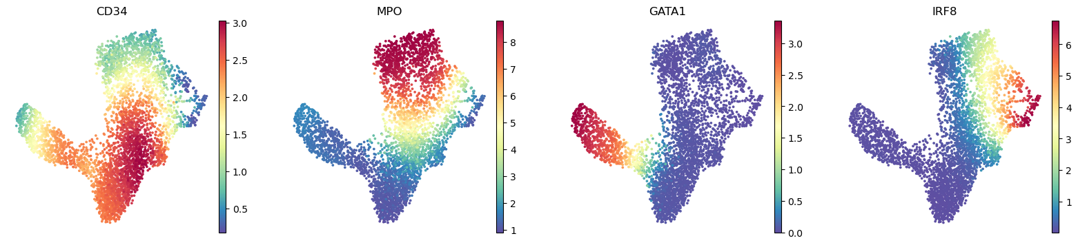
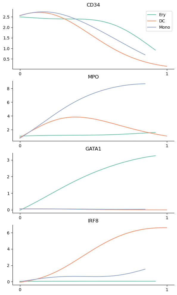
Gene expression can be visualized on umaps using the scanpy functions. The genes parameter is an string iterable of genes, which are a subset of the expression of column names. The below function plots the expression of HSC gene CD34, myeloid gene MPO and erythroid precursor gene GATA1 and dendritic cell gene IRF8.
[13]:
sc.pl.embedding(
    ad,
    basis="umap",
    layer="MAGIC_imputed_data",
    color=["CD34", "MPO", "GATA1", "IRF8"],
    frameon=False,
)
plt.show()
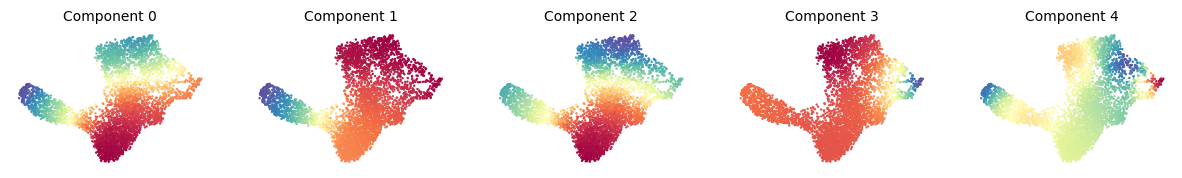
Diffusion maps visualization
The computed diffusion components can be visualized with the following snippet.
[14]:
palantir.plot.plot_diffusion_components(ad)
plt.show()
Running Palantir
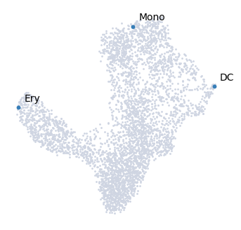
Palantir can be run by specifying an approxiate early cell.
Palantir can automatically determine the terminal states as well. In this dataset, we know the terminal states and we will set them using the terminal_states parameter
The start cell for this dataset was chosen based on high expression of CD34.
[15]:
terminal_states = pd.Series(
    ["DC", "Mono", "Ery"],
    index=["Run5_131097901611291", "Run5_134936662236454", "Run4_200562869397916"],
)
The cells can be highlighted on the UMAP map using the highlight_cells_on_umap function
[16]:
palantir.plot.highlight_cells_on_umap(ad, terminal_states)
plt.show()
[17]:
start_cell = "Run5_164698952452459"
pr_res = palantir.core.run_palantir(
    ad, start_cell, num_waypoints=500, terminal_states=terminal_states
)
Sampling and flocking waypoints...
Time for determining waypoints: 0.0031865517298380534 minutes
Determining pseudotime...
Shortest path distances using 30-nearest neighbor graph...
/fh/fast/setty_m/user/dotto/mamba/envs/da2/lib/python3.10/site-packages/joblib/externals/loky/backend/fork_exec.py:38: RuntimeWarning: os.fork() was called. os.fork() is incompatible with multithreaded code, and JAX is multithreaded, so this will likely lead to a deadlock.
  pid = os.fork()
Time for shortest paths: 0.208814803759257 minutes
Iteratively refining the pseudotime...
Correlation at iteration 1: 0.9999
Entropy and branch probabilities...
Markov chain construction...
Computing fundamental matrix and absorption probabilities...
Project results to all cells...
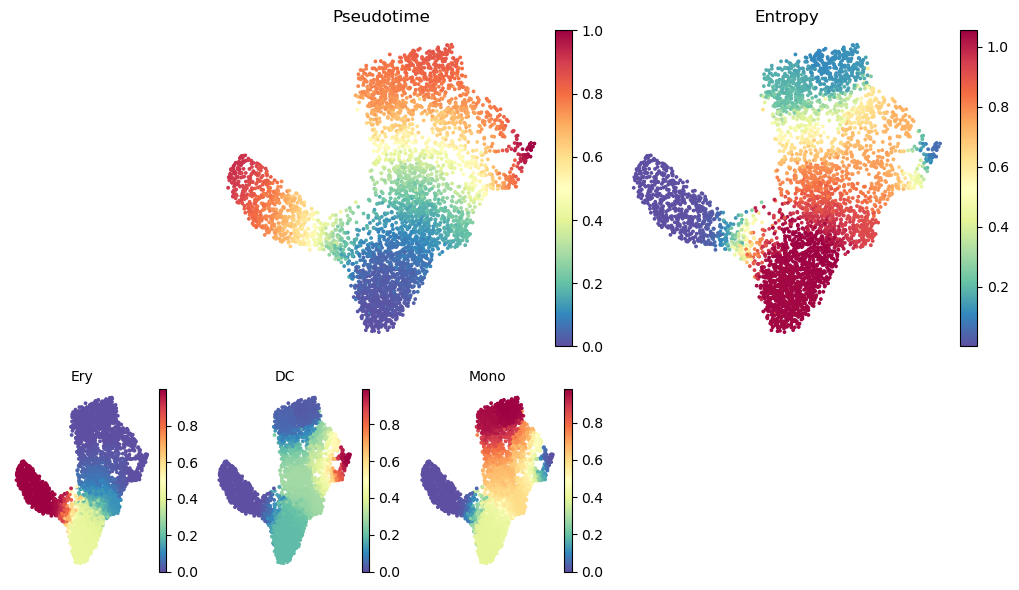
Palantir generates the following results
Pseudotime: Pseudo time ordering of each cell
Terminal state probabilities: Matrix of cells X terminal states. Each entry represents the probability of the corresponding cell reaching the respective terminal state
Entropy: A quantiative measure of the differentiation potential of each cell computed as the entropy of the multinomial terminal state probabilities
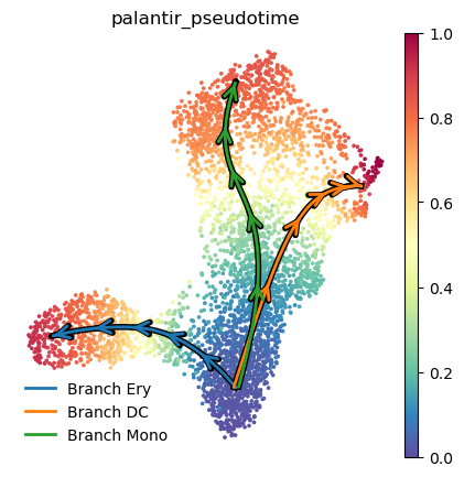
Visualizing Palantir results
Palantir results can be visualized on the tSNE or UMAP using the plot_palantir_results function
[18]:
palantir.plot.plot_palantir_results(ad, s=3)
plt.show()
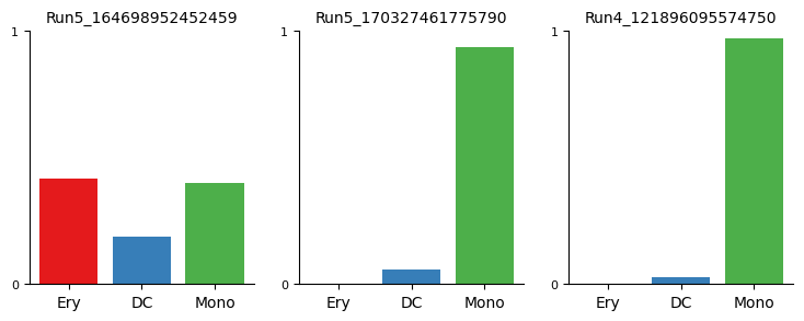
Terminal state probability distributions of individual cells can be visualized using the plot_terminal_state_probs function
[19]:
cells = [
    "Run5_164698952452459",
    "Run5_170327461775790",
    "Run4_121896095574750",
]
palantir.plot.plot_terminal_state_probs(ad, cells)
plt.show()
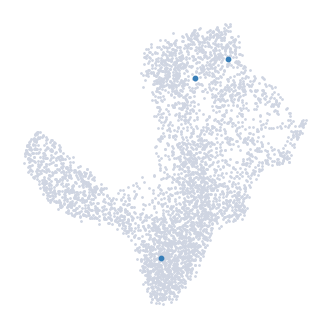
[20]:
palantir.plot.highlight_cells_on_umap(ad, cells)
plt.show()
Gene expression trends
Gene expression trends over pseudotime provide insights into the dynamic behavior of genes during cellular development or progression. By examining these trends, we can uncover the timing of gene expression changes and identify pivotal regulators of cellular states. Palantir provides tools for computing these gene expression trends.
Here, we’ll outline the steps to compute gene trends over pseudotime using Palantir.
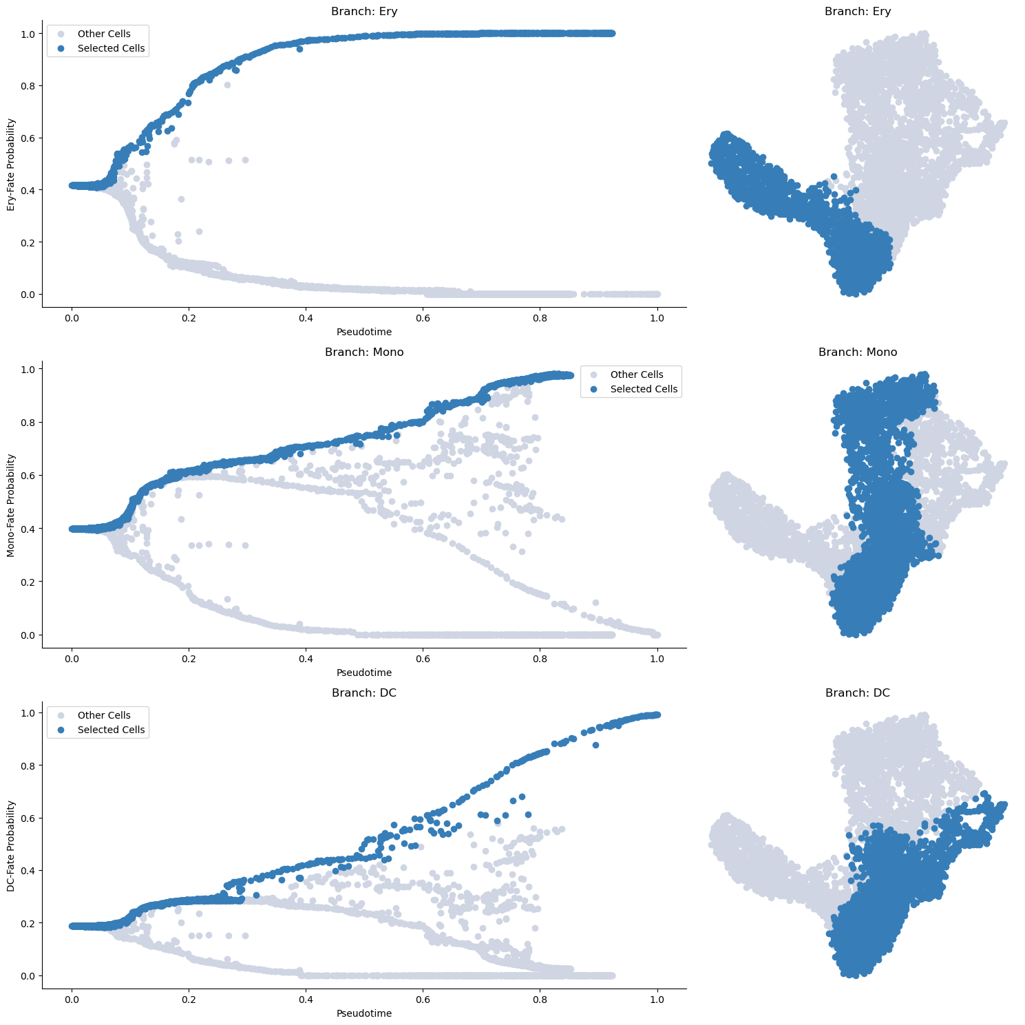
Selecting cells of a specific trend
Before computing the gene expression trends, we first need to select cells associated with a specific branch of the pseudotime trajectory. We accomplish this by using the select_branch_cells function. The parameters q and eps are used to control the selection’s tolerance. Select small values >=0 to be more sringent and larger values <1 to select more cells.
[21]:
masks = palantir.presults.select_branch_cells(ad, q=.01, eps=.01)
Visualizing the branch selection
Once the cells are selected, it’s often helpful to visualize the selection on the pseudotime trajectory to ensure we’ve isolated the correct cells for our specific trend. We can do this using the plot_branch_selection function:
[22]:
palantir.plot.plot_branch_selection(ad)
plt.show()
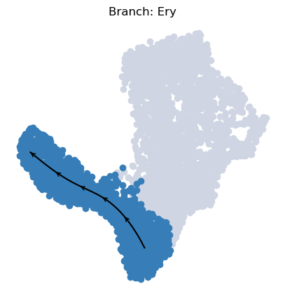
To visualize a trajectory on the UMAP, we interpolate the UMAP coordinates of cells specific to each branch across pseudotime, enabling us to draw a continuous path.
[23]:
palantir.plot.plot_trajectory(ad, "Ery")
[2024-05-15 13:27:43,708] [INFO    ] Using sparse Gaussian Process since n_landmarks (50) < n_samples (1,564) and rank = 1.0.
[2024-05-15 13:27:43,709] [INFO    ] Using covariance function Matern52(ls=1.0679415702819823).
[2024-05-15 13:27:43,733] [INFO    ] Computing 50 landmarks with k-means clustering.
[23]:
<Axes: title={'center': 'Branch: Ery'}>
The appearence of this plot is can be adjusted:
[24]:
palantir.plot.plot_trajectory(
    ad, # your anndata
    "DC", # the branch to plot
    cell_color="palantir_entropy", # the ad.obs colum to color the cells by
    n_arrows=10, # the number of arrow heads along the path
    color="red", # the color of the path and arrow heads
    scanpy_kwargs=dict(cmap="viridis"), # arguments passed to scanpy.pl.embedding
    arrowprops=dict(arrowstyle="->,head_length=.5,head_width=.5", lw=3), # appearance of the arrow heads
    lw=3, # thickness of the path
    pseudotime_interval=(0, .9), # interval of the pseudotime to cover with the path
)
[2025-04-08 15:07:03,359] [INFO    ] Using sparse Gaussian Process since n_landmarks (50) < n_samples (1,903) and rank = 1.0.
[2025-04-08 15:07:03,360] [INFO    ] Using covariance function Matern52(ls=1.0882231712341308).
[2025-04-08 15:07:03,383] [INFO    ] Computing 50 landmarks with k-means clustering (random_state=42).
[2025-04-08 15:07:03,802] [INFO    ] Sigma interpreted as element-wise standard deviation.
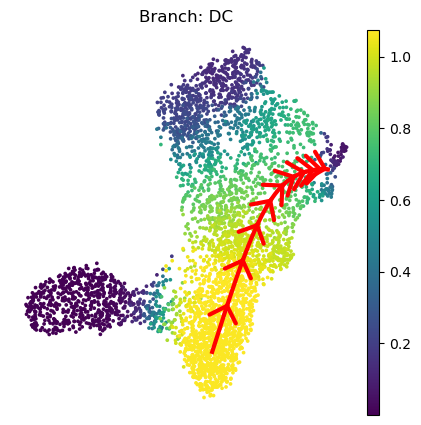
[24]:
<Axes: title={'center': 'Branch: DC'}, xlabel='UMAP1', ylabel='UMAP2'>
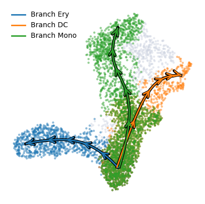
To plot multiple branches use the plot_trajectories with similar customizability. It’s default coloring is "palantir_pseudotime" since the overlapping branch masks are hard to vizualize.
[25]:
palantir.plot.plot_trajectories(ad, pseudotime_interval=(0, .9))
# When using cell_color="branch_selection" be aware of the overlap between branches:
palantir.plot.plot_trajectories(ad, cell_color = "branch_selection", pseudotime_interval=(0, .9))
plt.show()
Palantir uses Mellon Function Estimator to determine the gene expression trends along different lineages. The marker trends can be determined using the following snippet. This computes the trends for all lineages. A subset of lineages can be used using the lineages parameter.
[25]:
gene_trends = palantir.presults.compute_gene_trends(
    ad,
    expression_key="MAGIC_imputed_data",
)
Ery
[2024-05-15 13:27:46,561] [INFO    ] Using sparse Gaussian Process since n_landmarks (500) < n_samples (1,564) and rank = 1.0.
[2024-05-15 13:27:46,562] [INFO    ] Using covariance function Matern52(ls=1.0).
DC
[2024-05-15 13:27:48,515] [INFO    ] Using sparse Gaussian Process since n_landmarks (500) < n_samples (1,943) and rank = 1.0.
[2024-05-15 13:27:48,516] [INFO    ] Using covariance function Matern52(ls=1.0).
Mono
[2024-05-15 13:27:49,801] [INFO    ] Using sparse Gaussian Process since n_landmarks (500) < n_samples (2,541) and rank = 1.0.
[2024-05-15 13:27:49,803] [INFO    ] Using covariance function Matern52(ls=1.0).
The determined trends can be visualized with the plot_gene_trends function. A separate panel is generated for each gene
[26]:
genes = ["CD34", "MPO", "GATA1", "IRF8"]
palantir.plot.plot_gene_trends(ad, genes)
plt.show()
Alternatively, the trends can be visualized on a heatmap using
[27]:
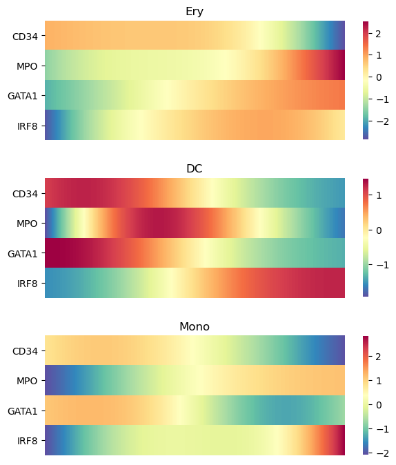
palantir.plot.plot_gene_trend_heatmaps(ad, genes)
plt.show()
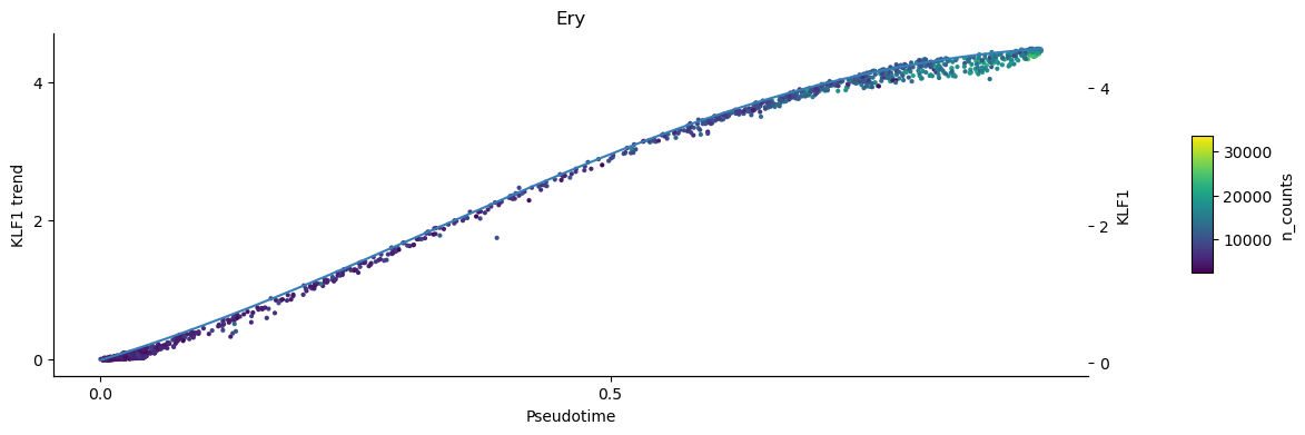
To inspect the trend of single genes you can use the plot_trend function. This plots the continous trend over the expression values of the individual cells. Omit the parameter position_layer="MAGIC_imputed_data" to show the inumputed log-expression values per cell instead.
[28]:
palantir.plot.plot_trend(ad, "Ery", "KLF1", color="n_counts", position_layer="MAGIC_imputed_data")
plt.show()
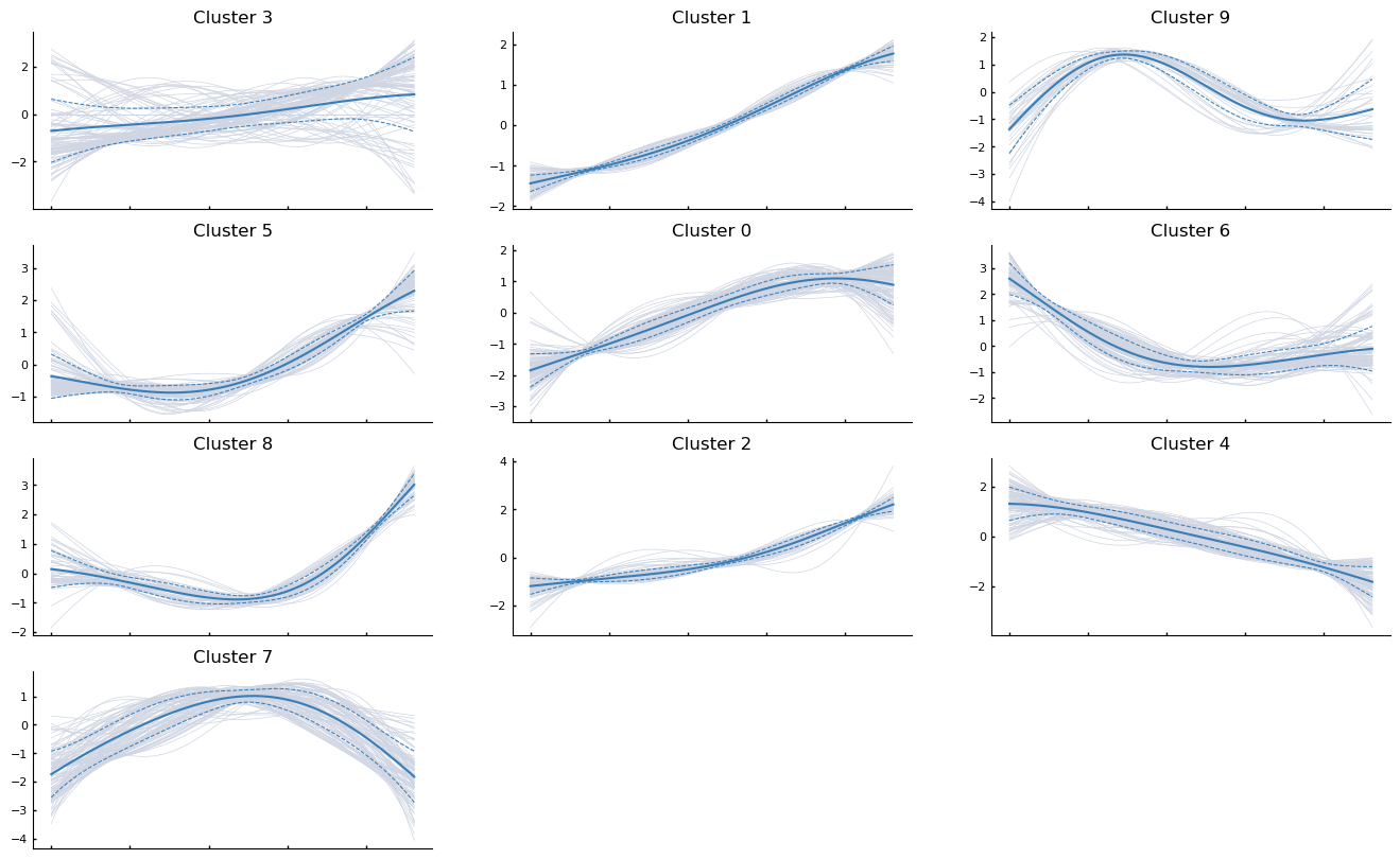
Clustering
Gene expression trends can be clustered and visualized using the following snippet. As an example, the first 1000 genes along the erythroid genes are clustered
[29]:
more_genes = ad.var_names[:1000]
communities = palantir.presults.cluster_gene_trends(ad, "Ery", more_genes)
/fh/fast/setty_m/user/dotto/mamba/envs/da2/lib/python3.10/site-packages/anndata/_core/anndata.py:430: FutureWarning: The dtype argument is deprecated and will be removed in late 2024.
  warnings.warn(
/fh/fast/setty_m/user/dotto/mamba/envs/da2/lib/python3.10/site-packages/palantir/presults.py:481: FutureWarning: In the future, the default backend for leiden will be igraph instead of leidenalg.

 To achieve the future defaults please pass: flavor="igraph" and n_iterations=2.  directed must also be False to work with igraph's implementation.
  sc.tl.leiden(gt_ad, **kwargs)
[30]:
palantir.plot.plot_gene_trend_clusters(ad, "Ery")
plt.show()
Save results
[31]:
file_path = os.path.join(data_dir, "marrow_sample_scseq_processed.h5ad")
ad.write(file_path)
[ ]: